Creating a Sample Data Brief for the Opioid Epidemic
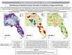
I used R Studio along with data compiled from the CDC and Washington Post to create three different maps showing clustered opioid patterns from 2013-2016 across the three states Alabama, Georgia and Florida.
The first map shows the average opioid overdose mortality rate per 100,000.
I carried out the Moran's I test which helped to describe the clustered patterning of opioid overdose mortality which are displayed in Map 2.
Next, I compared the residual maps of various linear regression models to carry out an analysis of the relationship between overdose and drug prescription dynamics.
Finally, I wrote up a plan of action to include in my sample data brief prepared for a public health task force.

")
")
")
")
")
I used R Studio along with data compiled from the CDC and Washington Post to create three different maps showing clustered opioid patterns from 2013-2016 across the three states Alabama, Georgia and Florida.
The first map shows the average opioid overdose mortality rate per 100,000.
I carried out the Moran's I test which helped to describe the clustered patterning of opioid overdose mortality which are displayed in Map 2.
Next, I compared the residual maps of various linear regression models to carry out an analysis of the relationship between overdose and drug prescription dynamics.
Finally, I wrote up a plan of action to include in my sample data brief prepared for a public health task force.